OneCard Reimagined
Feb 2, 2024

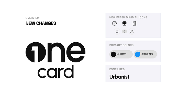
Experience the evolution of OneCard as it undergoes a transformative redesign, now infused with a vibrant brand identity. Witness the rebirth of authenticity, professionalism, and modernism

Minimalistic for Gen Z:
- Embrace simplicity with a minimalistic One Card logo, perfectly tailored for the Gen Z audience.
- Clean lines, reduced complexity, and a contemporary aesthetic resonate with the preferences of the modern generation.
Design System for Scalability:
- Implement a robust design system ensuring scalability across various platforms and applications.
- Consistent visual elements, adaptable proportions, and cohesive design principles for a seamless and scalable brand presence.
Modern Fonts — Aesthetic & Readable:
- Infuse a touch of modernity with carefully chosen fonts that strike a balance between aesthetics and readability.
- Typography designed for visual appeal while ensuring effortless readability, creating a harmonious and contemporary brand image.

